EXPLAINING OPEX DRIFT
First in a multi-part examination of dealers' gamma books

This post will be a little more technical, but it's important, so I urge you to read on.
Over the past couple of years there has been an increased interest in dealers' gamma charts to help explain market movements. Strategists such as Nomura's Charlie McElligott and Marko Kolanovic from JP Morgan have been elevated to god-like status on their analysis of this somewhat complicated concept.
My background is originally an institutional equity index trader, so although I enjoyed reading their reports to find the periods when dealers were either choking on soul-destroying quiet-market long gamma positions or scrambling with middle-of-the-night-vietnam-ambush war like short gamma positions, it wasn't immediately obvious how to use this in my trading. Yeah, sure I knew dealer positioning would dampen volatility when they were long gamma and exacerbate moves when they were short volatility, but to a large extent, the dealers were long gamma higher, and short gamma lower, so that seemed like a natural reaction. Markets go up an escalator, down the elevator. Surely, the prediction that higher markets will be more subdued and lower markets will experience higher volatility hardly seemed enlightening.
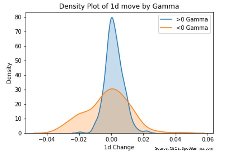
And it's a shame I didn't dig into the concept a little deeper. The other day my podcast partner Patrick Ceresna and I were privileged to have Brent Kochuba from SpotGamma.com on the show (listen to the whole episode here - Market Huddle ). He presented me with a chart that - once I saw it - instantly made me regret not working harder on the idea that dealer positioning is affecting the market.

There are a bunch of implications from this chart. Instead of trying to tackle them all at once, I will divide them into a few posts so that I can explain each portion more thoroughly.
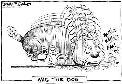
I want to take a moment to speculate why this dealer gamma analysis has become more important. Back in my day, when I hedged my options book, I barely dented the market. We were just one small player in a larger diverse marketplace. Nowadays, option strategies have become so popular that it's a case of the tail wagging the dog.

Whether this is result of low real rates forcing institutional investors into yield-chasing-strategies or whether it is the natural outcome of more sophisticated market participants, I am not sure. Regardless, the important thing to realize is that the preponderance of these option strategies is moving the markets in different way than previous decades. And it's important to try to understand in what way.
OpEx Drift
For those who aren't aware, OpEx stands for Option Expiry. Over the past few years, there has been a pronounced tendency for markets to rise in the week in front of a big expiry (typically the quarterly quad witching dates).

Why is that? I couldn't really confidently explain it until Brent from SpotGamma spelled it out in a language that my option-trader-brain could understand.
In most environments, the way the dealers' books are setup means that the theta decay results in a short covering of hedges.
Let's make up some theoretical positions to get a sense of how this works.
Typically, clients buy out-of-the-money put protection and fund that by selling out-of-the-money calls. Obviously that's not 100% of the trades, but on the whole, that's the way most dealer books set up.
So let's go through the option math of that position. I have chosen February's expiry and used 9% vol on the long call position and 12.5% vol on the short put position. Nothing changes between the two days except there is one less day in the calculations of the hedging deltas. What happens to the dealer's book between those two days?

If you have ever wondered why we tend to rally on OpEx week - here is your answer. This tendency only gets more pronounced in the final days of expiry and the decay of the needed-hedges accelerates.
Remember last Thursday and Friday? Both days saw end of the day spikes higher.


Do I think these spikes were solely the result of option hedging by dealers? Not a chance. Passive flows are often benched to the close so that is a contributing factor. But option expiry weeks are typically stronger than other weeks (with the next week being often showing weakness), and this option math shows why this is the case.
Don't underestimate the upward pull of the dealers' option book. All you need to do is look at Brent's chart:

Look closely at the blue curve. The center is not at zero. Its mean is positive. And yes, I know that it might be self-fulfilling (quiet rising markets result in positive returns), but then again, maybe the option market is driving these tendencies more than some participants realize. I certainly used to be counted in that camp. Not anymore!
In future posts I will examine other trading implications about this data. In the mean time, remember last week's rise might have more to do with dealer option hedging rather than fundamental developments. The everything-is-awesome-with-the-world crowd might be missing this possibility.
Thanks for reading,
Kevin Muir
the MacroTourist


Have you seen this site? https://squeezemetrics.com/monitor/dix?